Thursday, November 4, 2010

Abstract Atmosphere


The photo's that I made for my Abstract pictures were done with lot's of different layers. I did cheat a little bit by using a picture of a tree from the internet, but, I zoomed in a lot so it was a bunch of tiny little pixles so that you can't tell it's a tree. These pictures reminded me of outer space, or another dimension. The colors bled so beautifully almost as if they were neon lights in the night sky, with starts behind it.

Wednesday, October 27, 2010

Overlay


When the overlay assignment was given, the first idea that came to my head was puzzle pieces with some missing. Unfortunately, the photoshop elements at school did not have the puzzle overlay, so i had to make due with something else. I croped the photo so that the darkness and my face were at opposite sides of the picture. When i started removing some of the blocks, I thought it would look cool if I made it look like they were falling into the darkness, to represent some kind of story. I didn't want to overdue it so that there were too many blocks coming off of my face, so i thought that this final preview looked the best.

Monday, October 25, 2010

Surrealistic Photo


When this assignment was given, the first thing I tried to figure out was how I was going to add an egg, a clock, and a post of some sort look surrealistic. Then I looked at some examples and knew that it was impossible for a clock to hatch out of an egg... so I did that. And a clock couldn't possibly be a planet, so I did that as well. Since there was water in my background image I thought that maybe if the egg was bleeding and it turned the water red, it would give the picture a deeper feeling. Finally I noticed that there was a little person standing in the sand. and he was wondering how the egg could be laying a clock, and he had no way to get to the egg. I used the distort/liquify tool so kind of part the sea, so he now had a way to the egg.

Wednesday, October 13, 2010

Andy Warhol Silk Screen


For my Andy Warhol Silk Screen artwork, I used I picture that I had already previously photoshopped, so that the background would be a lot easier, because it was already cut out. I also like this picture because there are lots of different parts on me that can be different colours. The colors I used were different types of vibrant colors, with a retro vibe. One thing I did point out was that on my glasses in the middle screen, you can't really see the border around the lense, because the colors are so similar.

Friday, October 1, 2010

Keeping Christ in Christmas


This next assignment, we were to design a poster for Christmas. We had to use pictures that we had taken ourselves, and use a quote that was given to us. I used a picture of a Church that I took in Quebec about 2 years ago, and then a statue of Jesus' mother, Mary that was in the chapel at school. I used the quote from the Philippians 2:8-11 because I thought that it had the best meaning about remembering Christ. The tite of this is called "Keeping Christ in Christmas" and in the quote it says that of the name Jesus Christ, every knee should bow. This means that everyone should honour and remember our Christ.

Wednesday, September 22, 2010

Black & White

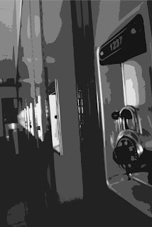
For my first black and white photo, I went with a classic locker picture. Taking the photo on an angle gives a more pattern look, and ads more to the picture. I used photoshop to convert the picture to Black and White, and used cutout filter, to make it look more cartoon-ish.


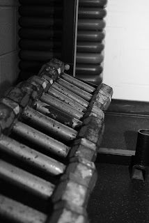
My second picture was takin in the Fitness room with my Nikon D3000, using my Sb-600 speedlight. I put the flash on low so it wouldn't have much glare on the weights. Using photoshop, I also converted this into black and white, but with an urban/snapshot style. This really makes the photo show the detail, and you can notice where the focal point of the picture is.


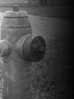
For my final black and white picture, I used a fire hydrant on the school yard. I used a gradient effect in photoshop to fade one side from black, to the main focus and the photo.

Thursday, September 16, 2010

New kid At School

Kirk Bulnes (Facial Structure)


Jose Sarmiento (Mouth)


Wesley Diaz (Eyes & Nose)

The new Kid


For My "New Kid At School", I used Kirk Bulnes face Layout. I tried to make my new kid with student that have similar skin colours, to make the facial parts blend in better. I decided to use Wesley Diaz's eyes and nose, and the Jose Sarmiento's lips. The nose could have blended in the the cheeks a little better, but i tried to do the best with the time that I had

Thursday, September 9, 2010

Mr. Onion Head Task #2


For My 2nd Task, I decided to make a Mr. Onion Head. I gave him some blonde hair, and fixed it up a little bit to make it look a little more retro. I gave him some glasses, big ears, and a Hitler Mustache.

Wednesday, September 8, 2010

Media Arts Task #1


My Name is Dylan McDermott, I am 16 years old and I want to become a photographer when I am older. I promote for a company called Entity Events, witch organizes All Ages events in clubs in the Tri-City Area. Since I want to become a photographer, I would like to be able to create art that is seen from a different point of view, so that I can look at objects differently from others to capture great photographs.

Josh Sommers - I thought that Josh Sommers is a very creative person who is able to create amazing artwork. His imagination is really wild, and I think that is what makes him such a spectacular artist.

Studio Rules - The required rules for this class are very reasonable, and I agree with them completely. I think that they set very good standards for the semester.

"No great artist ever sees things the way they really are. If he did, he would cease to be an artist." - Oscar Wilde (author)

This quote makes me see that every artist has there own way of looking at things. If every artist looked at everything the same, they would all create the same kind of art.