Media Arts By Dylan McDermott
Wednesday, January 5, 2011
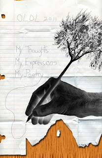
Poetry Cover Assignment
For this assignment, our class was given the opportunity to design the anual school poetry book for next year. I looked at some of the old ones and I enjoyed the look of the hand right on the cover making it look like someone was actually writing on it. I used to have a t-shirt that had a pencil turning into a tree and I really liked the artsy feel to it so I tried doing it for myself and I think it turned out pretty well. Finally, I put a piece of paper on the background to make it look more realistic then a normal photoshop edit. I had also free drawn the text on the paper to make it look real, instead of a normal photoshop font.
Thursday, November 4, 2010
Abstract Atmosphere
The photo's that I made for my Abstract pictures were done with lot's of different layers. I did cheat a little bit by using a picture of a tree from the internet, but, I zoomed in a lot so it was a bunch of tiny little pixles so that you can't tell it's a tree. These pictures reminded me of outer space, or another dimension. The colors bled so beautifully almost as if they were neon lights in the night sky, with starts behind it.
Wednesday, November 3, 2010
Wednesday, October 27, 2010
Overlay
When the overlay assignment was given, the first idea that came to my head was puzzle pieces with some missing. Unfortunately, the photoshop elements at school did not have the puzzle overlay, so i had to make due with something else. I croped the photo so that the darkness and my face were at opposite sides of the picture. When i started removing some of the blocks, I thought it would look cool if I made it look like they were falling into the darkness, to represent some kind of story. I didn't want to overdue it so that there were too many blocks coming off of my face, so i thought that this final preview looked the best.
Monday, October 25, 2010
Surrealistic Photo
When this assignment was given, the first thing I tried to figure out was how I was going to add an egg, a clock, and a post of some sort look surrealistic. Then I looked at some examples and knew that it was impossible for a clock to hatch out of an egg... so I did that. And a clock couldn't possibly be a planet, so I did that as well. Since there was water in my background image I thought that maybe if the egg was bleeding and it turned the water red, it would give the picture a deeper feeling. Finally I noticed that there was a little person standing in the sand. and he was wondering how the egg could be laying a clock, and he had no way to get to the egg. I used the distort/liquify tool so kind of part the sea, so he now had a way to the egg.
Wednesday, October 13, 2010
Andy Warhol Silk Screen
For my Andy Warhol Silk Screen artwork, I used I picture that I had already previously photoshopped, so that the background would be a lot easier, because it was already cut out. I also like this picture because there are lots of different parts on me that can be different colours. The colors I used were different types of vibrant colors, with a retro vibe. One thing I did point out was that on my glasses in the middle screen, you can't really see the border around the lense, because the colors are so similar.
Friday, October 1, 2010
Keeping Christ in Christmas
This next assignment, we were to design a poster for Christmas. We had to use pictures that we had taken ourselves, and use a quote that was given to us. I used a picture of a Church that I took in Quebec about 2 years ago, and then a statue of Jesus' mother, Mary that was in the chapel at school. I used the quote from the Philippians 2:8-11 because I thought that it had the best meaning about remembering Christ. The tite of this is called "Keeping Christ in Christmas" and in the quote it says that of the name Jesus Christ, every knee should bow. This means that everyone should honour and remember our Christ.
Subscribe to:
Posts (Atom)